Wednesday 9 April 2014

Final piece pictures :)


These are pictures of my final piece, id printed the front and back cover off, and the end pages, then taken photographs of it close up and at a variety of angles so that everything was visible

FINAL PIECE


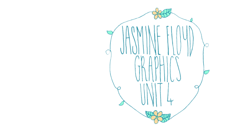
Here i have a small amount of screenshot's of my final piece being made. I had painted all of the components and then scanned them into photoshop where i ordered the pieces on the page. 
I am very happy with my final piece as it turned out to be better than i had imagined, although if i were to go back i would probably change how i had presented the title of the book on the page as i think it looks slightly out of place, but it ties in with the flaps. 


Monday 7 April 2014

Final Draft

For my unit 4 final piece i am planning to create a vegetable book, that looks like the above image, but in watercolour. I will be painting all of the separate components separately and then putting them together on the page. I will probably change my colour scheme as i think its too vibrant for a vegetable book, which i learnt from my conventions of the form. 

Sunday 6 April 2014

Final piece scamps


These were a few quick scamps i drew to help guide me for my final piece.

Thursday 27 March 2014

watercolour vegetable pattern.


This was a pattern i made out of my watercolour stained glass window, in practise of designing my end pages. 

Stained glass window idea.


I came up with the idea of creating a stained glass window front cover for my book because ilm planning on calling it 'the vegetable bible' so it relates to the church etc. I created these pieces in two different media's, one in watercolour and one in ink, which i layered on photoshop in various colours and used a layer style on.

Sunday 23 March 2014

Pineapple lino print experiment.

At this point in the course i'm still playing around with different techniques so that i'm sure on the media i will use for my final. This was a small experiment of which i created a Lino print that i then used on photoshop to create various coloured print's. 


CRAP Analysis.

Repetition. 
Contrast.

 Grid
 Contrast.
 Repetition. 
 Grid.
 Proximity.
My crap analysis helped me to really look into the layout in book covers, i was able to study the grid, the proximity, repetition and contrast, which has helped me to understand how books are typically presented, in comparison to another book.

Monday 17 March 2014

Drafting for final.


I did this experiment to try and decide on what media i would create my final piece in. I used a black fine liner for this piece and then used photoshop to colour it in. Although i thought this piece was sucessful i found that it did'nt look like a professional book cover should, and just more of a draft, and found that i prefered the look of watercolour. 

Friday 14 March 2014

Type.


Creating my own type face.
I decided to create my typeface in this style because i previously went through a book of vintage packaging designs and took notes and studied the types of font's used, which helped me to come up with this!

Wednesday 12 March 2014

Type face research.


For my final piece I'm planning to create a Book cover on vegetable's, in the style of an old fashioned seed packet, so therefore i went through a book of vintage packaging and looked at the font's used, jotting them down as i went along, so that i could have some inspiration for when i create my own type face, i have created a small gif of pages from the book that i used for this experiment.